Project Overview
Product:
- Graines de Génie (Seeds/Kernels of Genius) was a series of 9 extensive educational CD ROMs, to train children (age 6-15) in French, English, maths, history, geography and science, through lessons and exercises, as well as through an exploratory 3D adventure game, in which they could playfully test and apply their cross-curricular knowledge.
- The series was used at numerous primary and secondary schools in France, and regularly updated, to match the national school curriculum. It was also successfully sold for school training at home.
Project:
- Upgrade of the entire series for a new release.
- Development of new key modules for education, navigation and progress-tracking.
- Improvement of the series’ overall usability and visual design.
- Enhancement of the visual harmony between existing (and new) elements.
Client:
- Mindscape – one of France’s leading producers and distributors of multimedia products for education & gaming, and licensee of renowned brands like Disney and Riverdeep.
Conditions:
- Tight technical and style restrictions, complying with an existing framework and existing user base.
- Challenging production deadlines, related to the start of the new school year.
- Several contract-based projects, with increased responsibilities.
- Small team (1 project manager, 2 developers and I), in collaboration with user-testing teams and educational experts.
Tools:
- Adobe Flash & Director
- Adobe Illustrator & Photoshop
Roles:
- Artistic Direction
- Ideation & Conceptualization (of new key modules for education, navigation and progress-tracking)
- Graphic Design and Animation
- Image and Sound Treatment
- Programming of XML-driven SWF pieces that communicate with their C++ environment
Deliverable:
- An upgraded series of 9 extensive educational CD ROMs, for children (age 6-15) at school and at home.
Achievements:
- The new series resulted in major international sale improvements – from 120 000 to 150 000 copies – up by 25 %.
Print-Out:
1. Dictation Module
Task:
- A brand new dictation module was needed, to add to the series.
- I was responsible for its visual design (from scratch), which needed to blend in with existing modules, and comply with the existing framework.
- I also assisted the lead developers by programming parts of the module.
Dictation module elements:
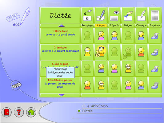
- Menu (with for each choice: 5 modes, print, source & progress info)
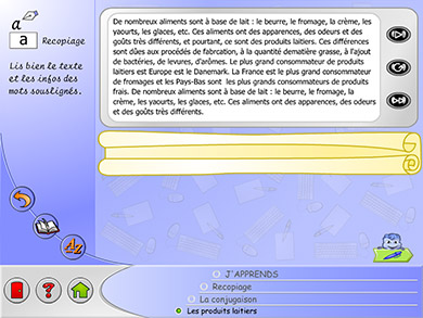
- Dictation (for 5 modes: classic, guided, prepared, copying, with gaps)
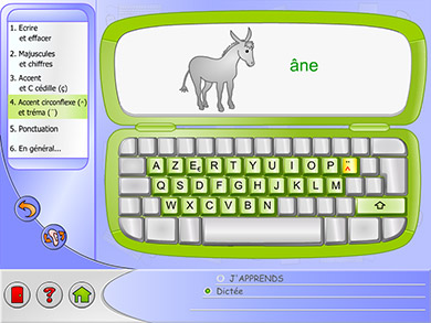
- Keyboard lesson (for the younger age groups)
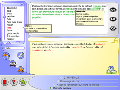
- Lexicon panel (to look up words)
Process:
- I made paper-sketches and proposals at the team’s brainstorm sessions.
- I then transformed these into graphics and animations (and coded parts), which the team integrated into the final product.
Extra miles:
- I invented a new progress feedback system, which was clear (at a glance), fun (animated on mouse-hover) and word-less (catering for even the youngest users), and was integrated throughout the entire series.
- I invented an engaging story for the dictation screens, displaying text in a machine, and the child’s writing as handwritten copy on a roll of paper. This playful story approach is more appropriate for the target group, while still harmonising with existing modules (designed as plain exercises). It surprised and delighted the company, and was applied throughout the module (giving the keyboard lesson & lexicon their own contextual story).
Images:
- These screens are from different school levels/products in the series.
2. Adventure Guides
Task:
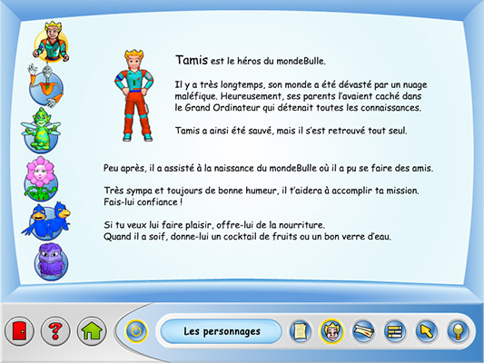
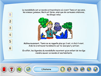
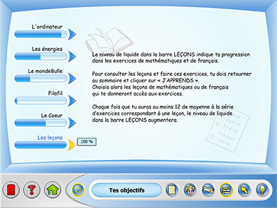
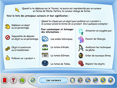
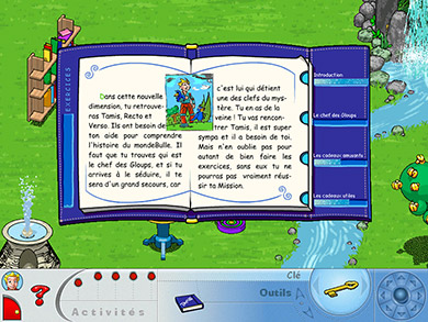
- The 5 existing 3D adventure games needed 5 new dynamic guides (each with 6 topics, to select in the navigation bar).
- I was responsible for their visual design (which needed to blend in with existing modules and comply with the existing framework), as well as for their xml-driven AS programming.
Process:
- I analysed the main usability & design weak-points of the existing guides, and made sketches of improvement proposals.
- I then transformed these sketches into digital graphics and animations, and wrote the xml-driven code to display them dynamically, after which the lead developers integrated the guides into the final products.
Achievements:
- My new guides brought huge usability & design improvements.
- I designed full-screen guides (as opposed to the small originals).
- I gave them a machine-style (previously an old-fashioned book-style).
- I united them with the navigation bar (previously separated and different).
- I placed clear contextual menus inside the guides (previously, these menus were nested in an unclear toggle button on the general navigation bar).
- I redesigned the navigation bar to give clear feedback on the current & possible guide information, through a button highlight and text (replacing an unclear toggle button without any text).
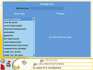
- View my improvements: See before/after image 20.
Images:
- These screens are from different school levels/products in the series.
3. UI Upgrading
Task:
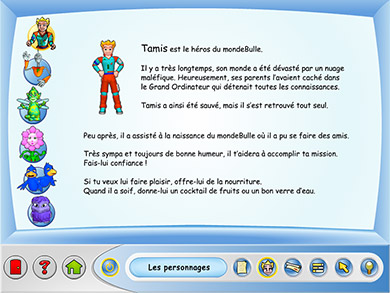
- The existing educational interfaces needed to become more modern, vibrant, clear, and in harmony with each other. The modules were: French, Maths, Discovery (Science/History/Geography) and Knowledge Test.
- I was responsible for their visual re-design (which needed to re-use the existing educational content and comply with the existing framework).
Process and achievements:
- My new interfaces brought huge usability & design improvements.
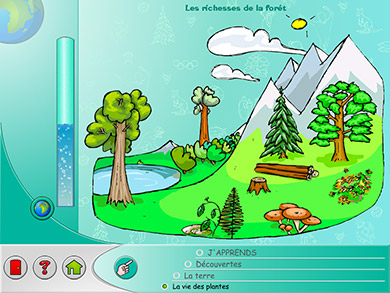
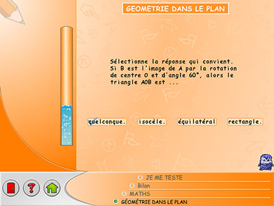
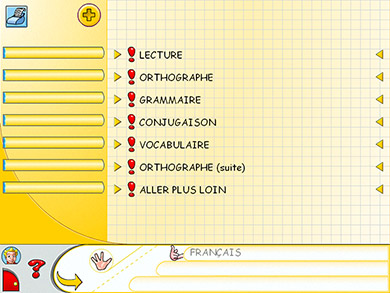
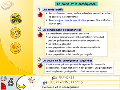
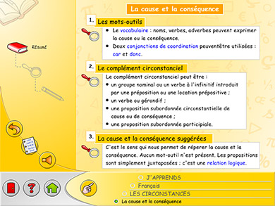
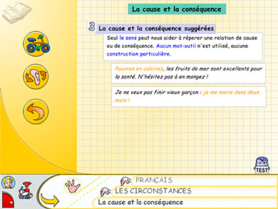
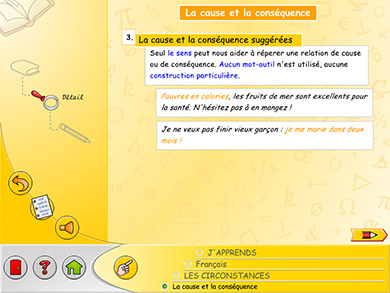
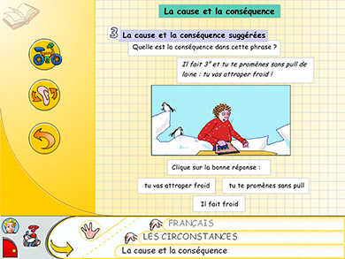
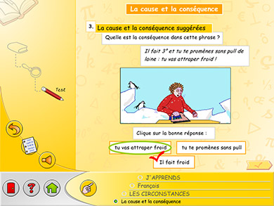
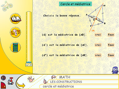
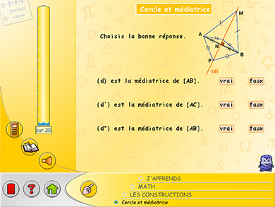
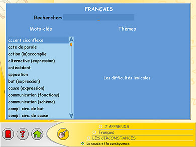
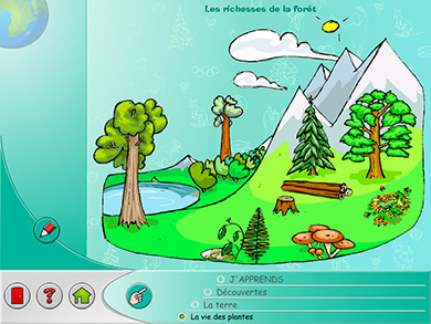
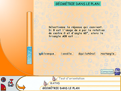
- I introduced a clear breadcrumb navigation for deeper lesson levels (lesson, lesson-detail and lesson-detail-test), where previously a deeper level had no reference or trail.
- I designed new icons to replace unclear ones (replacing e.g. the ‘Gloup’ monster by a red pencil, to enter the deeper test level).
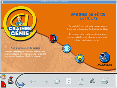
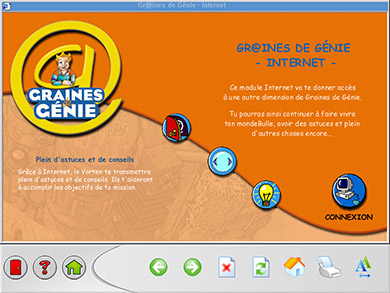
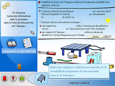
- I repositioned and harmonised the internal module controls, placing the 3 buttons on a curve (as in the Internet module), with Back always left, Lesson/Exercise central, and Audio (or another helpful aspect) right.
- I gave all modules more harmonising internal colour schemes, vibrant backgrounds, subtler patterns (for better readability), and a clear visual reference by an icon in the top-left corner.
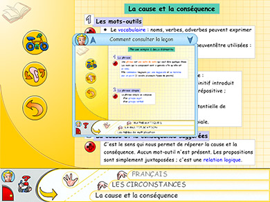
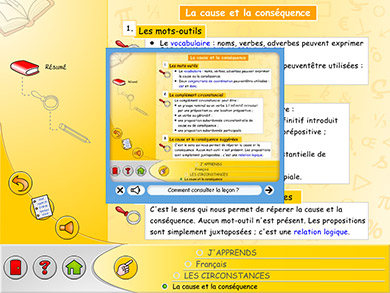
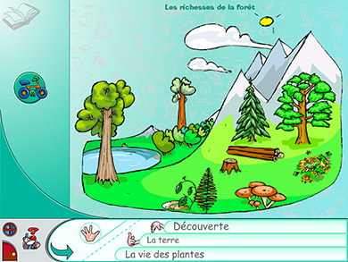
- View my UI improvements: See before/after images 10-17.
Images:
- These screens are from different school levels/products in the series.
- For technical & emotional legacy reasons, I wasn’t allowed to e.g. replace all ‘Gloup’ monster icons or the water gauge as side panel progress bar; and couldn’t harmonise all titles (as some were part of re-used images).
4. Multifunctional Menus
Task:
- The series needed new menus in different sections, with several sublevels, content preview, progress information, and selection feedback.
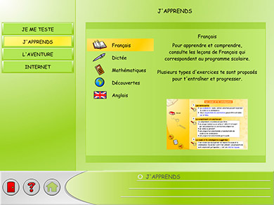
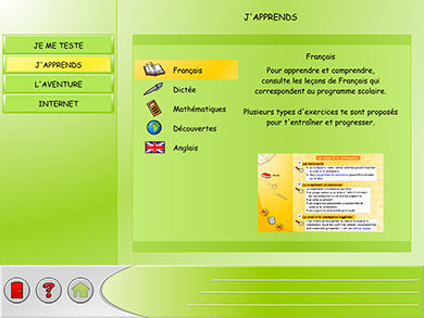
- The new welcome screen needed a top level menu (for the 4 themes), and a secondary menu (with content previews of the theme’s subjects).
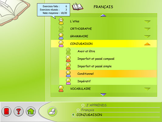
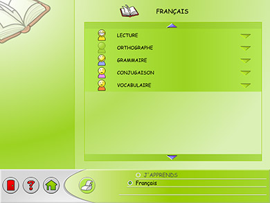
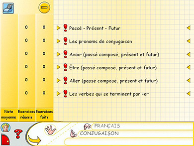
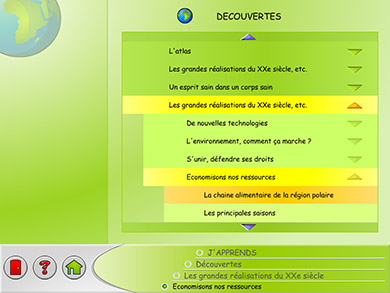
- The French, Maths & Discovery subjects needed new hierarchical top level menus, reflecting the child’s progress in each matter (for French & Maths), and a clear feedback on the current (or last) selection.
- I was responsible for the conception and graphic design of the new menu screens, and assisted in their programming.
Process and achievements:
- My new menus harmonised throughout the series, improving its usability.
- I made the current and possible screen options much clearer (navigation was previously unclear, by the lack of accordion menus).
- I grouped features more clearly (e.g. progress feedback used to be listed in a separate side panel, left of the menu options).
- I brought a clear visual separation between menu screens and actual content screens, helping the children to focus on the content.
- View my usability improvements: See before/after images 5-9.
Images:
- These screens are from different school levels/products in the series.
5. Navigation Bars
Task:
- The series needed a variety of clear and modern navigation bars for its different sections.
- I was responsible for their visual design, graphics and animation.
Process and achievements:
- My new navigation bars brought huge usability & design improvements.
- I made their options clearer (e.g. by emphasising text besides icons)
- I made the bars less cluttered (by removing unclear or unwanted elements, e.g. by moving sub-menus to the content-area where they belong).
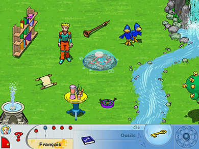
- I harmonised them with the content area (e.g. making the adventure guide look like a machine, with a monitor and control part).
- I gave them a warm & modern look (with more vibrant colours & new icons).
- View my navigation bar improvements: See before/after images 15-21.
Images:
- These screens are from different school levels/products in the series.
6. Before & After
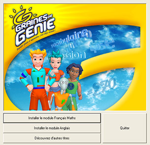
1. Install/Start Screen:
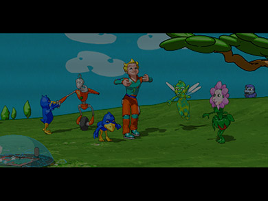
2. Splash Screen (Animation):
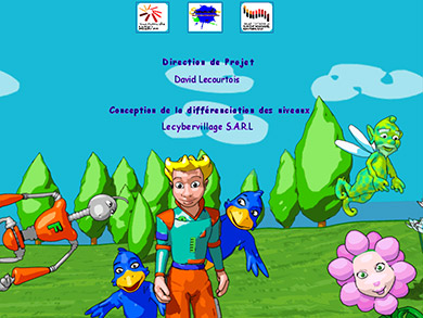
3. Credits (Animation):
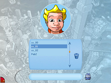
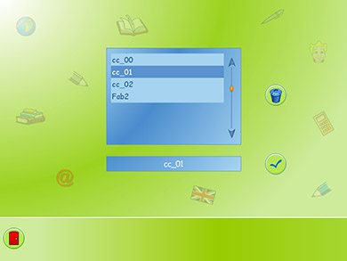
4. Login:
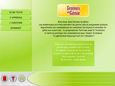
5. Welcome:
6. Activity Overview:
7. Menu Level 1 (French):
8. Menu Level 2 (French):
9. Menu Level 1 & 3 (Discovery):
10. Lesson (French, top level):
11. Lesson-Detail (French, 1 sublevel deep):
12. Lesson-Detail-Test (French, 2 sublevels deep):
13. Exercises (Maths):
14. Help (French, question mark):
15. Index (French, pointing hand):
16. Discovery Lesson:
17. Knowledge Test:
18. Internet Module:
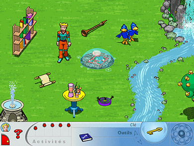
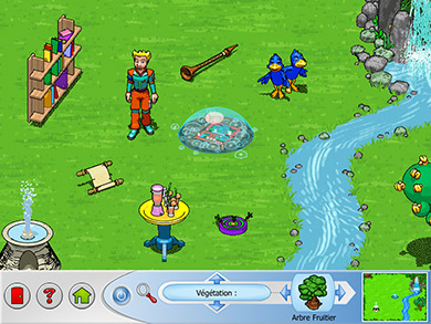
19. Adventure:
20. Adventure Guide:
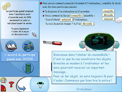
21. Adventure Object Manipulation:
Before my input:
The series of 9 products needed to re-used its 5 intricate 3D adventure games.
They needed minor design tweaks, a new navigation bar, and debugging.
After my input:
New navigation bar, button design & placement.
I also debugged and partly re-wrote the adventure’s AS code.
Jump back up to read more about upgrading the navigation bar, or jump all the way back to the top.
