Project Overview
Project:
- The Reuters Slideshow is a graceful, gestural hybrid app (combining FlashLite 3 and WRT widget functionalities), displaying a constantly updated feed of pictures and their article summaries.
- It uses intuitive gestures and smooth animations to display 16 live feeds for 4 countries (US, UK, India and Japan) in 4 categories (Top News, Sports, Business and Technology).
- Users can easily scroll through images, smoothly call-up associated text, share articles, and click through to the full stories, using e.g. zoom, pan/scroll and automatic slideshow options.
Focus:
- Image-based news reader.
- Clear UI, based on swipe gestures and icons.
- Rapid Prototyping as the key design tool.
Client:
- Thomson Reuters, a world leading source of information for businesses and professionals.
Conditions:
- I worked for Thomson Reuters at digital agency Tui interactive media.
- I was given carte blanche to create an app around their beautiful press images.
- I led a brilliant junior visual designer in our small 2-person team, while the agency’s CEO directed us in our design process.
Tools:
- Adobe Flash, Photoshop
Turning/Learning Points:
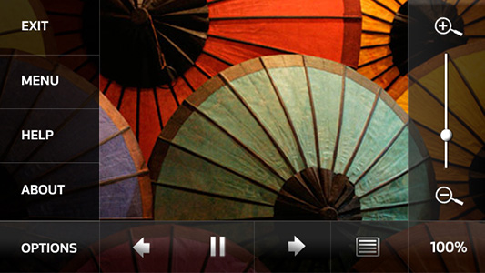
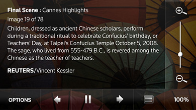
- We initially overcomplicated the app’s UI (e.g. by grouping too many options in one menu, and by integrating a zoom-slider), and learned by doing that “less is more”.
- We also learned that completely hiding affordances (ways to interacts) leads to uncertainties (e.g. when we used the accelerometer to go from image to image, or when we only revealed our navigation bar after tapping a clean fullscreen image), so “a bit more is better than nothing”.
Roles:
- Ideation & Conceptualization
- Usability, Design & Brand Consultation
- Rapid Prototyping & Mockups
- Programing of the actual app
- Project Management & Client Communication
- Product presentation (e.g. at MWC)
Deliverable:
- An award-winning, pre-installed & highlighted news reader app.
Achievements:
- Winner of the ‘Calling All Innovators’ Grand Prize in the Flash category (the competition received 1,700 entrees from 85 countries).
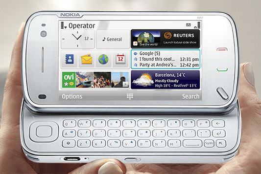
- Pre-installed worldwide (in 75 countries) on all Nokia’s flagship N97 and 5800 (Music Express) touch screen devices, and prominently placed on their launcher screens.
- Featured in the ‘Forum Nokia Design Gallery’ as an exemplary app.
1. Early Versions
Process:
- We used Rapid Prototyping from day one, to test our ideas on real devices.
- Our team (a brilliant junior visual designer and I) would brainstorm ideas, after which I would rapidly build a (new) working prototype (version), replacing placeholder assets by designer graphics when needed & ready.
- This iterative process would be punctuated and guided by meetings with the agency’s CEO and stakeholders from Nokia and Thomson Reuters.
- We tested app versions on device prototypes (provided by Nokia), via RDA (remote device access), as well as in-house at and by Nokia.
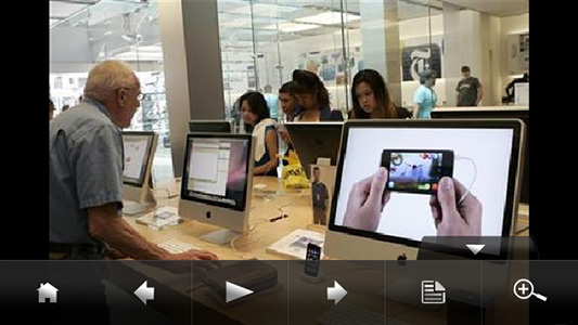
- We achieved a balanced UI after initially placing too many or too little visual clues and controls on the screen (as shown in these images).
Extra miles:
- My strong developer skills enabled us to rapidly test UX & design ideas on real devices, for realistic app evaluation, improvement & presentation.
- This agile approach allowed us to quickly try out innovative UX ideas, like using the accelerometer for interactions (e.g. to navigate images by left/right phone-tilts; to show/hide text by up/down phone-tilts, to zoom in/out by moving the phone up/down, or to do a reset by shaking it).
- I solved the issue that images couldn’t be treated outside the app (the recommended procedure), by letting the app efficiently rotate all portrait images to landscape (the app’s format) and scale (enlarge or reduce) all images to fit the display as large as possible.
Images:
- These images of an early version are just quick Photoshop-mockups (showing an incorrect zoom-slider percentage & image/text toggle state).
2. Released Version
Process:
- We continued our iterative rapid prototyping process, as described above.
- We made options more contextual & intuitive, and decluttered the screens, by re-grouping settings, help & credits on the top-level.
- We made the UI icon-based, complying with Nokia’s pre-installation rules for worldwide released devices (localized for at least 19 languages).
- The agency further developed the widget’s Web Runtime (WRT) & server-side features.
Achievements:
- We entered the app in a competition and won.
- Nokia pre-installed and highlighted the app on their flagship devices.
- We presented our app at MWC in Barcelona.
Images:
- These images show the same screens as above, but in the released version.
3. App Overview
Main Interactions:
- Press the app’s Miniview on the launcher screen to open the app
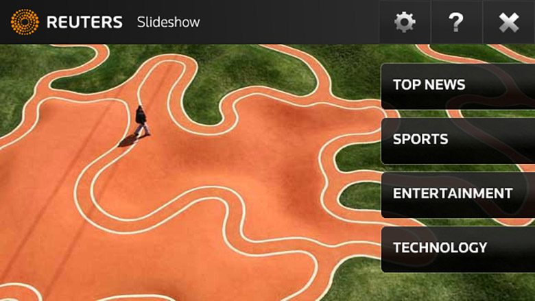
- Press a category button on the app’s home screen to select a feed
- Swipe left/right for the next/previous image or article (10 per feed)
- Swipe up/down to show/hide an article on top of its image
- Long-press on the image will also slide up its article
- Double click to enlarge/reduce an image or article
- Press and move an enlarged image to pan
- Press and move the scrollbar handle to scroll a large article
- Press the navigation bar handle to show it on top of an image or article
- Press the bar’s handle, one of its options, or above the bar to hide it
- Press the bar’s text/image toggle to change the display mode
- Press the bar’s zoom button to enlarge/reduce an image or article
- Press the bar’s play/pause button to start/stop the automatic slideshow of images or articles (allowing more time per article than per image)
- Press the bar’s next/previous buttons to navigate images or articles
- Press the bar’s home button to return to the app’s home screen
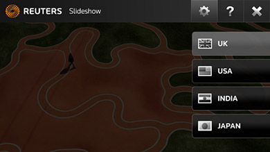
- Press the home’s settings button to select the feeds’ country (4 options)
- Press the home’s help button, to view release information, credits, and links to the agency, Reuters & support website
1. Settings & Help:
2. Gestures, Menu, and Automatic Slideshow Mode:
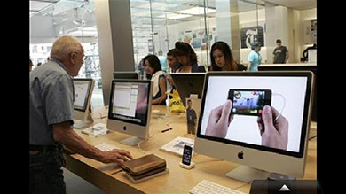 2.1. Image screen – Swipe up for the article; swipe left/right for next/previous image; double-click to enlarge; long-press the image or press the tab for its contextual menu.
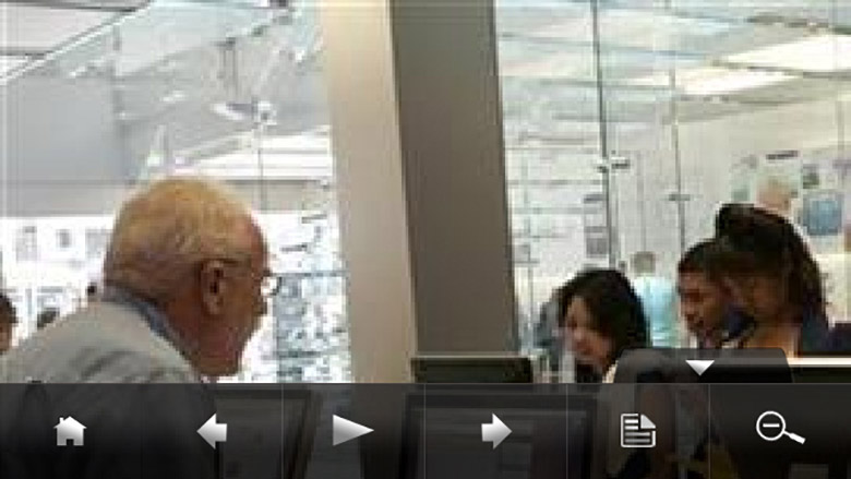
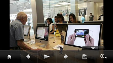 2.2. Image with its menu – Options: home; previous; play/pause automatic slideshow; next; text/image view; enlarge/reduce. Press the image or menu-tab to close the menu immediately, press an option to close it after a delay.
 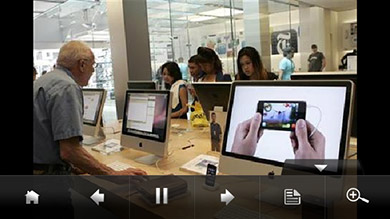 2.3. Image in automatic slideshow mode – Press the pause button to return to manual navigation mode (and to close the menu after a delay).
3. Text Zoom & Scroll:
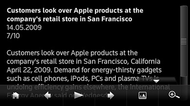
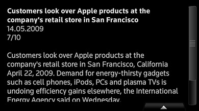 3.1. Text screen – Swipe down for the image; swipe left/right for next/previous article; double-click to enlarge; drag the scrollbar handle to scroll; press the tab for its contextual menu (with options as listed under 2.2).
 3.2. Enlarged text – Drag the scrollbar handle to scroll; double-click the text to reduce it again; swipe down on the text to return to its image. The latest text scale is restored when text is called again, independently from the image scale.
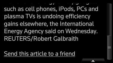 3.3. Scrolled enlarged text – Share the article with a friend; scroll it; double-click to reduce it; swipe down on the text to return to its image.
4. Image Zoom & Pan:
 4.1. Image screen – Double-click the image to enlarge it (or use the menu for this, see 2.2); for other image-interactions see 2.1.
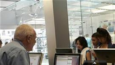 4.2. Enlarged image – Drag to pan the image; double-click to reduce it again (or use the menu for this, see 2.2). When the image is enlarged, its article can only be called up through the menu.
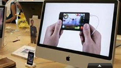 4.3. Panned enlarged image – Drag to further pan the image; double-click to reduce it. The contextual menu can always be called up by long-pressing the image or pressing the menu tab.
5. Toggle buttons:
 5.1. Image with its menu – Notice the button icons for view-mode (offering text-view) and zoom (offering to enlarge). Press the enlarge option to scale up (and to close the menu after a delay).